Data Visualization
California Wildfires
Tool
Excel, Raw Graph, Illustrator
Timeline
March – May 2019
2019 China Visualization and Visual Analytics Conference
2019 International Design Education Expo & Conference
Exhibition
Project Overview
This series uses data on the California wildfires that burned more than ten thousand acres from 2000 to 2018, Illustrating the increasing destruction of fires in the present day. It also draws data on the amount of natural and man-made California fires between 1997 and 2017 and explores the symbiotic relationship between man and nature.
Over the last few years, fires that burned more than ten thousand acres of land have occurred more frequently and on larger scales. The duration of each fire has also increased. In fact, the largest wildfire in California's history occurred in 2018.
The wild and -urban interface (WUl) at the border between nature and human society is a hot spot for human-environment conflicts, particularly wildfires. Although this project does not address or include wildfire potential, the WUl is among the highest at-risk areas in California when it comes to wildfire. Taking into consideration the increasing amount of destruction wildfires are now causing, wildfire safety awareness has become more critical for California residents than ever
This series consist of three parts
PART 1
This data visualization shows California wildfires that burned more than ten thousand acres from 2000-2018.
PART 2
This part makes a comparison of the amount of wild fires caused by humans and nature from 1997 - 2017.
PART 3
A concept-based interactive installation prototype in which proximity between the viewer and the screen metaphorize the relationship be tween wildfires started by nature and human activities.
PART 1
Inspiration
This project was inspired by the frequent appearances of wildfires in California's news stations, the burnt evidence of them scattered throughout national forests and on the sides of highways, and the close proximity to and deep understanding of their impact and destruction shared by residents of Californium.
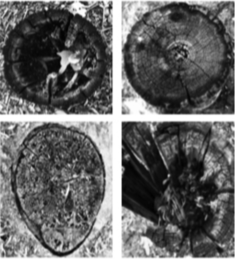
Many of the design elements used throughout the pieces n this project visually mimic images relevant to wildfires. Including tree rings, charred wood, and burning flame. These design choices create a deeper, more personal impact from the otherwise stark data.
The overlap of the brown circles is similar to burning flame to serve as a warning to the viewer of the increasing danger.
The data visualization chart is inspired by the shape and texture of burnt tree trunks.
Datasets
This dataset examines California wildfires over 1,000 acres from 1997 to 2017, detailing acres burned, causes, and damage. It also highlights the Wildland-Urban Interface (WUI) areas, calculating population density by dividing total population by land area. The data illustrates how population growth in WUI areas impacts wildfire frequency and intensity.
Outcome
PART 2
Introduction
From an ecological, point of view, wildfires are not entirely bad. Natural forest fires are a form of sell-renewal and maintain a healthy ecological balance. Thus, when comparing the amount of natural versus man-made California forest fires between 1997 and 2017, we used blue to convey the positive aspect of naturally caused forest fires.
Pairing the blue representing natural forest fires with the red of man-made ones results in a visual, contrast. Embedded in this is a wake-up call for the audience. the amount of red emphasizing the clear majority of man-made forest fires.
Datasets
This dataset contains records of California wildfires from 1997 to 2017, listing key details such as the fire name, the responsible agency, dates of alarm and containment, and the cause of each wildfire. It includes the acreage burned, the methods used to suppress the fires, and the objectives of each operation. The causes vary from equipment use and arson to unknown or unidentified origins, offering insights into the factors contributing to wildfire occurrences and management strategies employed to contain them.
Conclusion
Through visualization of the same data, we discovered that in recent years many more forest fires have been caused by human factors than natural factors. From the timeline analysis, human-caused fires have significantly extended past the predictable seasons of natural forest fires, leaving California residents to live under the threat of forest fires for the entirety of the year.
Outcome
PART 3
Interactive Concept
The piece employs automatic detection technology to create a more personal relationship between the viewer and the work itself.
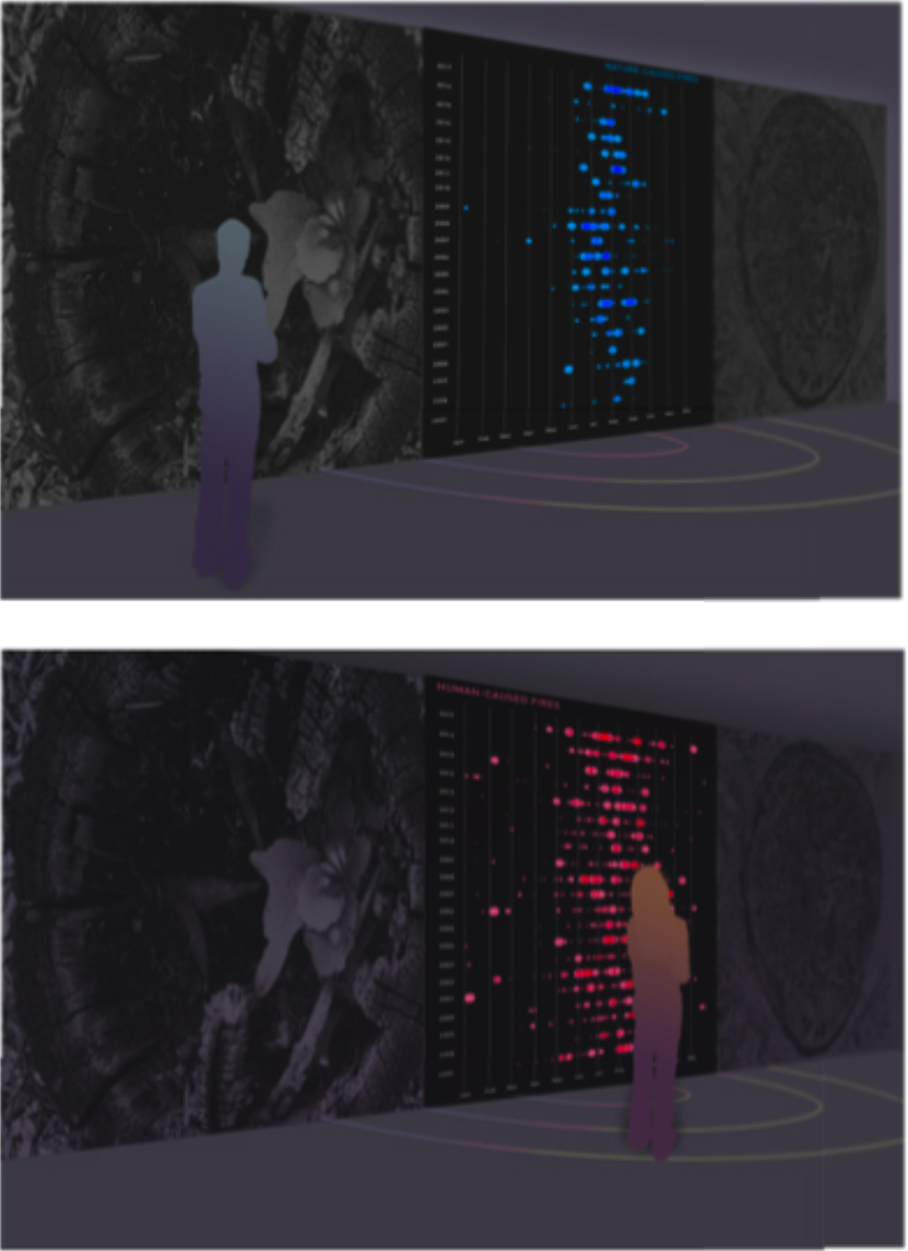
A screen is mounted between blown-up pictures of charred tree trunks, alluding to the destruction the fires leave behind. A sensor attached at the top of the piece will track a viewer's proximity to and position around the piece. The rings on the floor indicate physical borders the viewer can cross to interact with the piece.
If the viewer is outside of the area the sensor can detect the screen will display the data on the amount of natural wildfires (PART 2).
Once the first semi-circle is crossed, the data will switch to display the amount of both natural and man made fires in the summer season. The data will switch to autumn once the next semi-circle is crossed, and winter and spring with the last two. As the viewer walks closer and closer to the piece, the number of blue circles on the screen will start inevitably decreasing as the summer and fall seasons end.
The last screen would display more dots of blue enveloped by red. Combined with the position of the viewer, it becomes both a physical and visual embodiment of human interference in nature.


