Visual Identity
Little America Brewery
Role
Personal, class project
Tool
Illustrator, Photoshop, Indesign
Timeline
March – May 2019
Project overview
I designed the brand identity for Little America Brewery, a craft brewery in Curtis Bay, Baltimore. The process involved identifying key elements from Maryland’s culture and the brewing process, exploring logo concepts through sketches, and refining them into polished logomarks. The final design is a bold and memorable logo that reflects the brewery’s local roots and dedication to quality craftsmanship.
EXPLORE
Researching and Prioritizing Elements
My goal here was to identify and prioritize the visual elements that would best represent Little America Brewery’s brand identity. I began by researching and categorizing these elements into Iconic, Symbolic, and Index categories. This helped me focus on the brewery’s deep connection to Maryland’s culture and the craft brewing industry.
Iconic Elements: These are direct representations and easily recognizable visuals.
Symbolic Elements: These elements convey deeper meanings or represent Maryland’s heritage.
Index Elements: These are more abstract and can inspire the visual style or texture of the brand.
Click image to see details
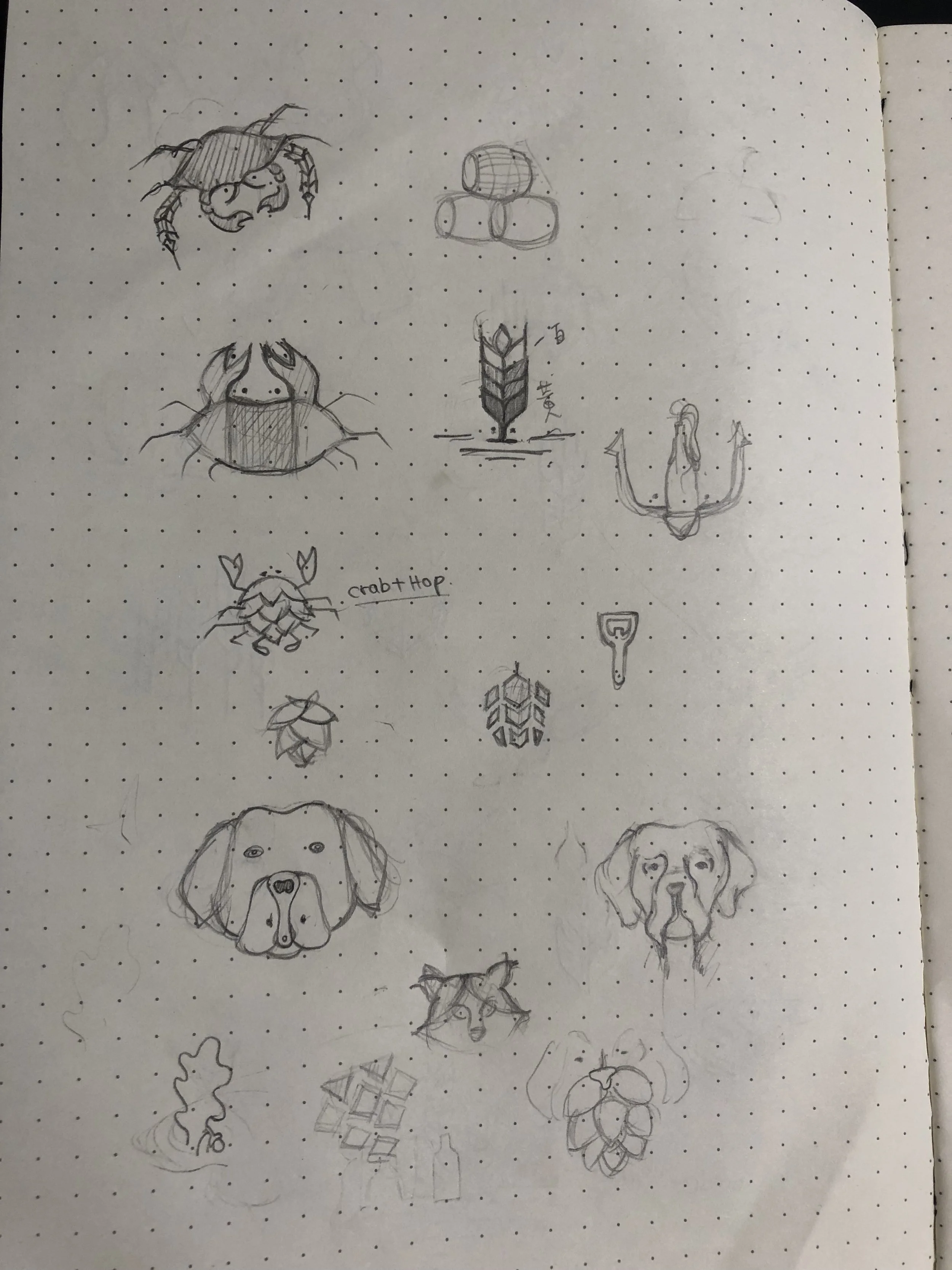
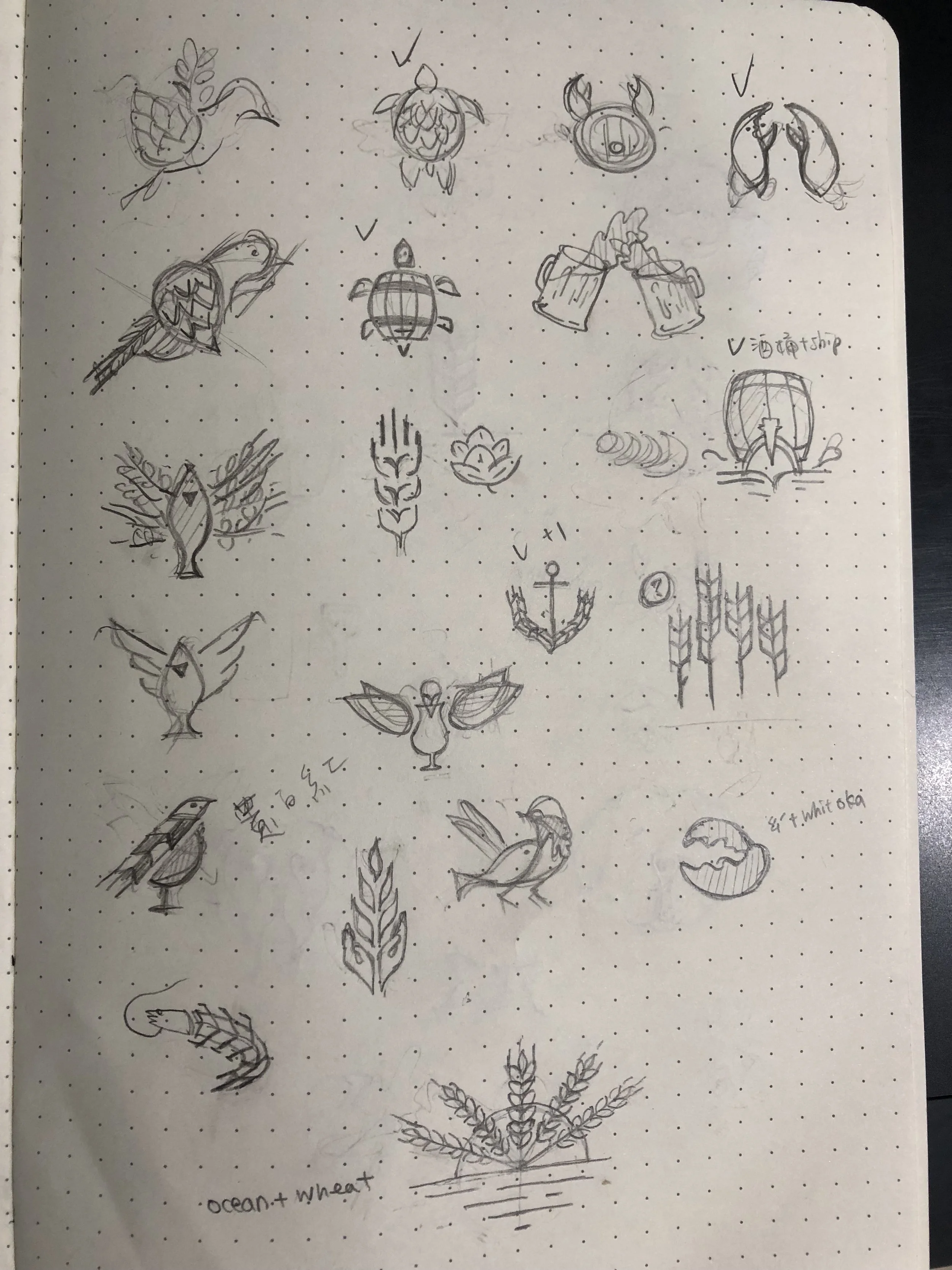
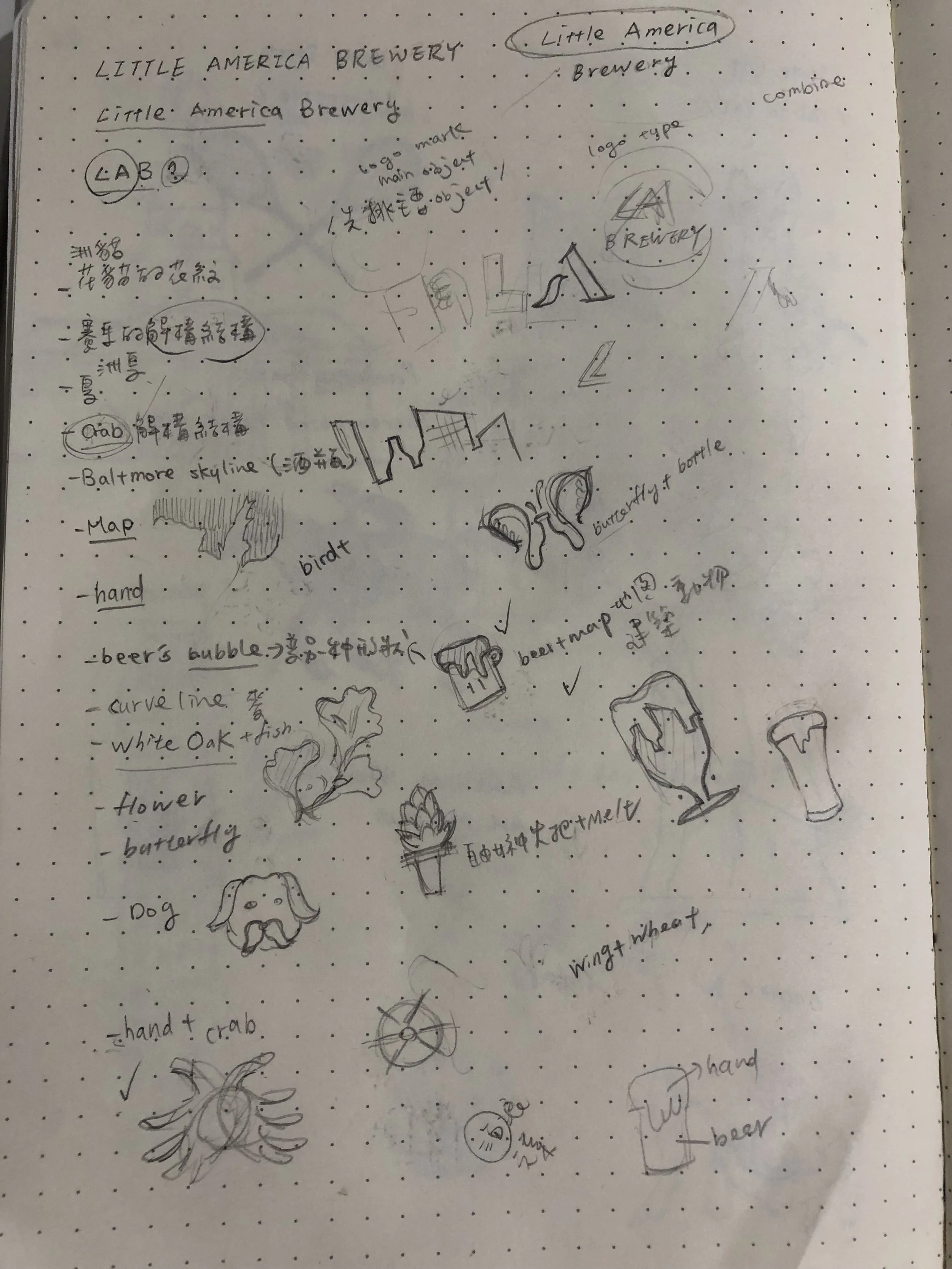
Initial Sketches
At this stage, I wanted to explore as many visual ideas as possible, without limiting myself. I started sketching various combinations of the elements I had prioritized, playing with different layouts and concepts to see what might work. This was all about getting ideas down on paper and beginning to visualize the brand.
DEVELOPMENT
Logomark exploration
With my initial sketches in hand, I moved on to refining and developing the strongest concepts into more polished logo marks. I used illustrator to iterate on my sketches, focusing on clarity, versatility, and making sure the designs had strong symbolic resonance. During this phase, I tested different configurations and abstracted some elements to create unique and memorable logomarks.
Color exploration and logo refinement
Next, I began exploring different color schemes to bring the logos to life and further refine the designs. I experimented with various palettes that reflect the brand’s identity, testing how the logos looked in different color combinations. This helped me find the most effective and visually appealing options that could work across all brand applications.
REFINEMENT
Final Concept Selection
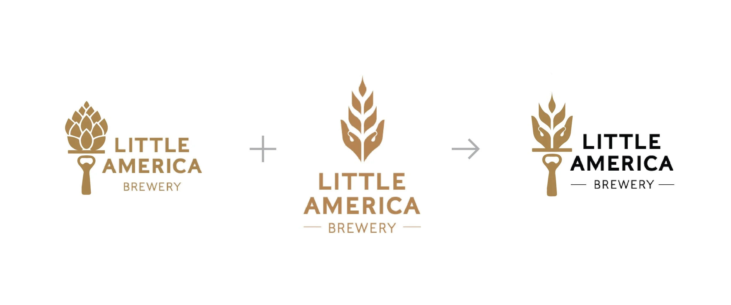
After refining the logos, it was time to narrow down the choices. I carefully evaluated the designs against the core values and product identity of Little America Brewery. I selected the two most promising concepts and worked on refining them even further, taking into account feedback and ensuring that they truly aligned with the brand’s vision.
FINALIZE
Final Design
Finally, I arrived at the fully developed brand identity for Little America Brewery. I finalized the logomark with precise geometric construction, ensuring it would work across a variety of applications.


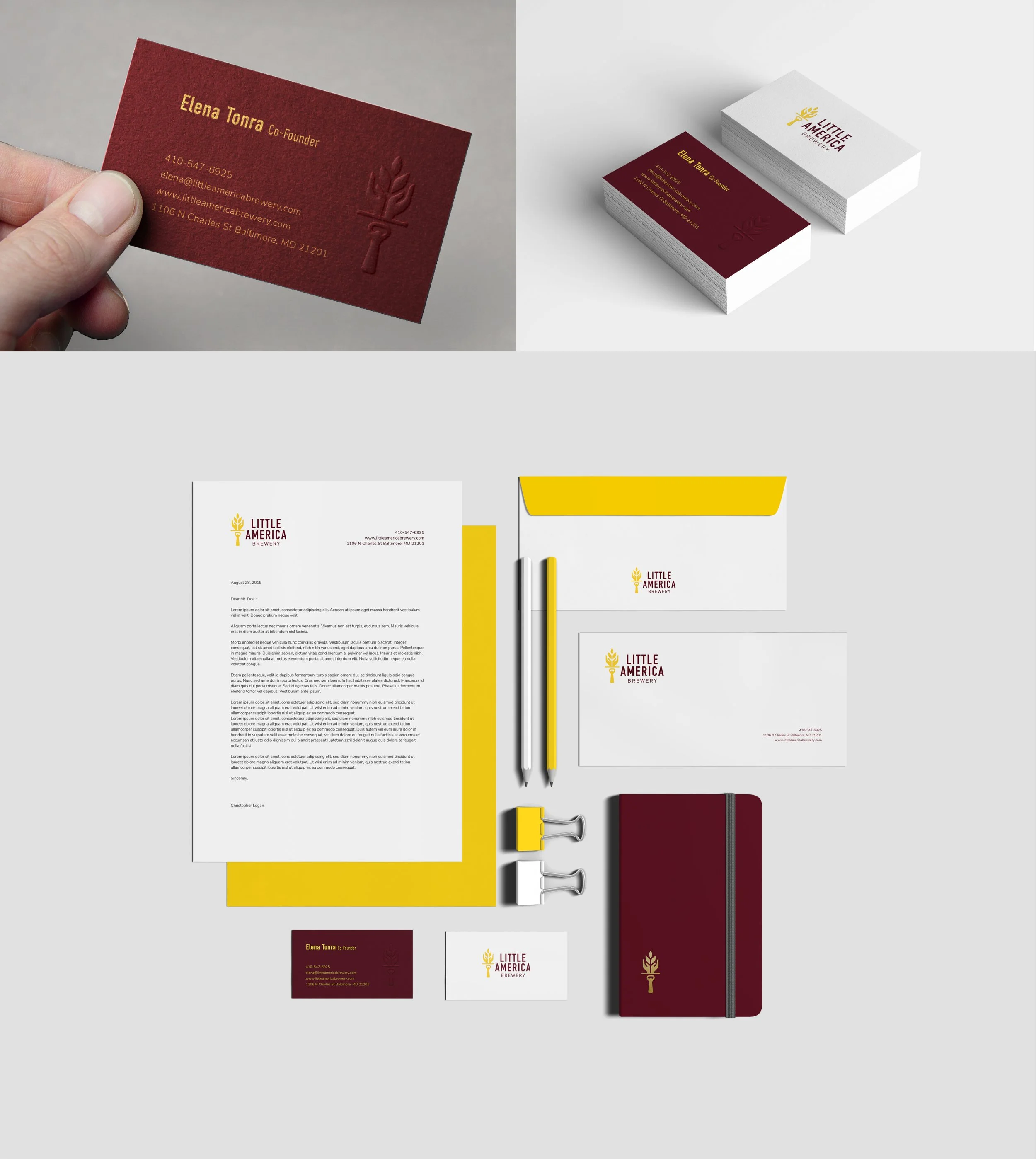
Applications
DELIVERY
Visual Identity Manual
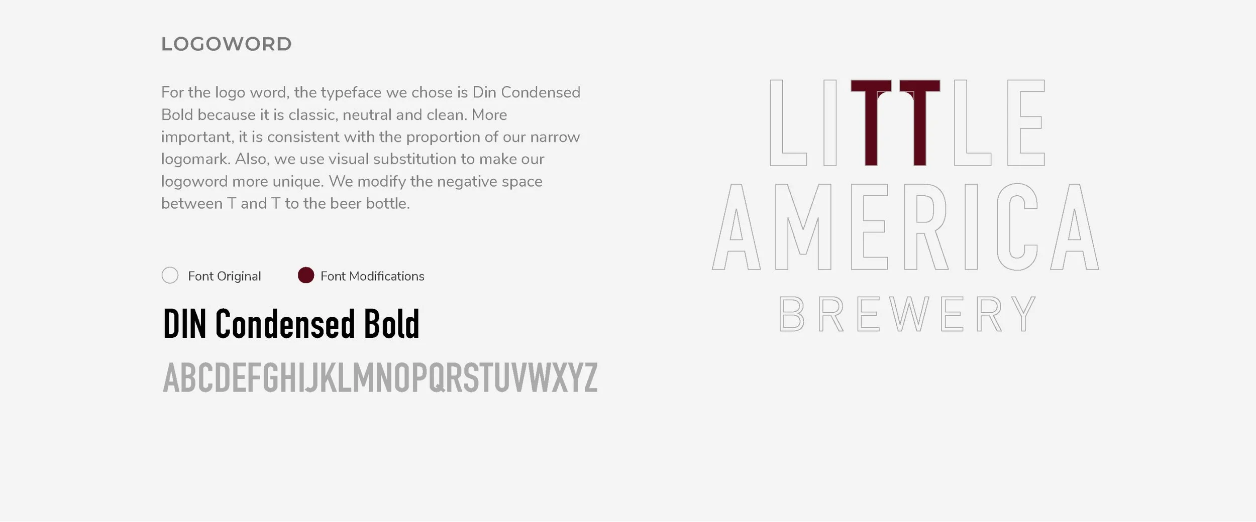
These visual guidelines establish the core design elements for Little America Brewery, ensuring a consistent and cohesive brand presence. This section details the proper usage of the logomark, color palette, typography, and supporting visuals, providing clear direction for maintaining brand integrity across all platforms.

